
iOS 11.3 brings new Animoji, Battery Health, better ARKit, Business Chat, and more!
iOS 11.3 is Apple's spring update for iPhone and iPad. It features a few higher-profile new or expanded features, including fun new Animoji lions, dragons, and bears, new settings for battery health that should make every #iPhoneSlow follower happy, as well as new additions to ARKit that'll have you up the wall — ha! not sorry! — and Business Chat for iMessage, which... might do the same!
ARKit gets crisper and... goes vertical
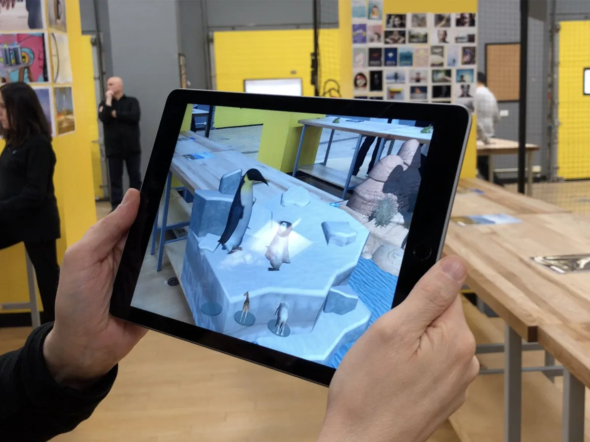
Where ARKit was previously limited to understanding horizontal surfaces, Apple is now providing the ability to map and make use of vertical and irregular surfaces as well. That means you can have virtual posters, paintings, even walls and doors exist alongside the real thing. It allows for experiences like virtual museums and gateways to other words. It'll also all looks better thanks to higher resolution support and auto-focus.
After spending some time with it and some new ARKit apps, the differences are subtle but profound. Peering into a painting and walking around it in a way that would get you banned from a real gallery are all acceptable — and enjoyable! — in AR. It's also getting to the point where I'm starting to forget what's AR and what's IRL. I saw a baby elephant on a table and immediately reached out to pet it. (I saw someone else — no names! — try to take a selfie before realizing the AR wouldn't be there for the camera!)
Apple is all-in on ARKit from Tim Cook on down, and it shows.
What's new with ARKit in iOS 11.3
Animoji dragon, bear, skull, and lion
Break out the karaoke. Again. Apple is adding a quartet of new emoji to the iPhone X Animoji feature.
That includes:
- Dragon
- Bear
- Skull
- Lion
No doubt this will be the most popular new feature in iOS 11. At least for the first 24 hours. Which is fine. Animoji has always been meant as a tech demo to show off what ARKit's face detection was capable of in a fun and engaging way. It's done that and now the updates serve as reminders and (re-)engagement points.
Hopefully, lots more from third-parties will be possible in iOS 12.
iMessage Business Chat
Apple's Messages app isn't just for talking to people anymore. Now, you'll be able to talk to businesses as well — though with complete privacy and control. I haven't had a chance to try this yet, so I'll just quote from Apple for now and update when and if I do.
Business Chat is a new way for users to communicate directly with businesses right within Messages. This feature will launch in Beta with the public availability of iOS 11.3 this spring, with the support of select businesses including Discover, Hilton, Lowe's and Wells Fargo. With Business Chat, it's easy to have a conversation with a service representative, schedule an appointment or make purchases using Apple Pay in the Messages app. Business Chat doesn't share the user's contact information with businesses and gives users the ability to stop chatting at any time.
Battery health and servicing info, plus a throttle toggle
Apple is rolling out Battery Health as a surfaced feature in Settings in the wake of negative reaction to iPhone advanced power management — the system that slowed down older iPhones with degraded batteries to prevent shutdowns.
It provides information on current maximum capacity and peak performance capability, and will also inform you if your iPhone is being slowed down, whether it needs service, and will even allow you to turn off advanced power management — now called performance management — if you so choose.
If your iPhone SE, iPhone 6, iPhone 6s, or iPhone 7 had been slowed down due to prevent an unexpected shutdown, iOS 11.3 will restore it to its previous, unmanaged performance levels. Performance management will only kick back in when and if you experience another unexpected shutdown. Until then, it's a clean slate.
Peak performance capability is the ability of your iPhone's battery to supply adequate charge even in the face of highly demanding tasks, up to and including those that cause power spikes.
Apple shows the following messages, depending on the capability to handle peak performance:
- 100%: Your battery is currently supporting normal peak performance.
- 95%: This iPhone has experienced an unexpected shutdown because the battery was unable to deliver the necessary peak power. Performance management has been applied to help prevent this from happening again. Disable…
- 79% or less: Your battery's health is significantly degraded. An Apple Authorized Service Provider can replace the battery to restore full performance and capacity. More about service options…
- Unknown: This iPhone is unable to determine battery health. An Apple Authorized Service Provider can service the battery. More about service options…
If you disable performance management, you'll see the following message:
This iPhone has experienced an unexpected shutdown because the battery was unable to deliver the necessary peak power. You have manually disabled performance management protections.


You can also use these settings to disable performance management... to a point. Performance management has never been completely about batteries. All processors have always been throttled to protect against heat, for example. That kind of performance management can't be disabled — it would literally allow your iPhone to fry. So, the only performance management you can disable is the battery-related performance management Apple introduced with iOS 10.3.1.
it'll also only stay disabled unless and until you suffer another unexpected shutdown due to a power spike your battery can't handle. Then it'll kick back in. You can disable it again, but it will be re-enabled every time you experience that kind of shutdown.
And as a reminder, this doesn't affect iPhone 8, iPhone 8 Plus, or iPhone X, which use a different method to manage peak power draw, nor does it affect iPads, which have batteries so large it's unlikely they'd ever power down in face of powr spikes.
Overall, I love all this stuff. It took what happened to get here, but it would have been great if we could have started here to begin with.
Health Records
Participating medical institutions and health providers are now able to share patient date with you directly through the Health app. I haven't had a chance to test this yet, so again I'll quote from Apple:
The new Health Records feature brings together hospitals, clinics and the existing Health app to make it easy for consumers to see their available medical data from multiple providers, whenever they choose. Patients from participating medical institutions will have information from various institutions organized into one view and receive regular notifications for their lab results, medications, conditions and more. Health Records data is encrypted and protected with a passcode.
And more: Music videos, News videos, HomeKit software authentication, Advanced Mobile Location
As always, there's a bunch more in iOS 11.3 as well.
- Apple Music will soon be the home for music videos. Users can stream all the music videos they want without being interrupted by ads. They can also watch the hottest new videos, the classics or ones from their favorite artists back-to-back in new music video playlists.
- Apple News now makes it easier to stay up-to-date on the most important videos of the day with a new Video group in For You, and improved Top Stories.
- HomeKit software authentication provides a great new way for developers to add HomeKit support to existing accessories while protecting privacy and security.
- Support for Advanced Mobile Location (AML) to automatically send a user's current location when making a call to emergency services in countries where AML is supported.
I love all the attention Apple News is getting but it's still immensely frustrating that it's only available in the U.S., U.K., and Australia. Apple managed to launch Apple Music in 100 countries at the same time and it can't get News into more than 3 after several years? It's one of Apple's best services and it's simply not available to most of its customers. Immensely. Frustrating.
The HomeKit software authentication is terrific as well. The previous, hardware-only model was a terrific way to force a lax industry into actually caring about security but it increased overhead and slowed deployment. It was a worthwhile tradeoff but to be sure, but advances in technology inevitably lead to better, easier solutions. With software authentication in HomeKit, we should see even more vendors coming on board. And I can't wait.
iOS 11.2 adds Apple Pay Cash, faster charging, better stability, and more.

One of the marquee features of iOS 11.2 didn't actually ship yet. I'm talking about person-to-person Apple Pay in the U.S. (Yes, sadly it's U.S.-only at launch.) Apple pushed iOS 11.2 out a few days early to patch a date-related springboard crash but the server-side component for P2P Apple Pay still isn't going live until early this week. I've had a chance the chance to try out person-to-person Apple Pay a little early and I really like it. We see how it holds up when it goes wide. (Perhaps by the time you're reading this, it will have already.)
Several emoji have been tweaked in iOS 11.2. Emojipedia has the full set of changes but they include a return to a proper glass of Whiskey, a new, cuter ant, a more Leica-like camera, and a better metallic finish to all the cutlery.
iOS 11.2 also brings faster inductive charging to iPhone 8, iPhone 8 Plus, and iPhone X owners. It's up to 7.5w now. It's still not as fast as wired charging over Lightning but it will make your charge pads charge just a little bit faster. I've been using it through the betas and, while it's definitely a nice to have, if you're primarily using inductive charging overnight like I am, it won't make a real difference to you. If you're charging interstitially at your desk it might give you a bit of a faster boost.
There are three new live wallpapers for iPhone X. There's one that's all reds and oranges, another that's all blues and greens, and a third that swirls together almost all the colors. They're a nice addition and contrast to the cleaner gaussian blurs and nature-themed clouds that were already included.

HealthKit now supports downhill snow sports. Hopefully, I'll get to try those out this winter. There's also a new Sports section in TV.app, including a Sports tab and sports-related notifications.
Control Center on iPhone X now displays a transparent indicator on Lock screen... which I really don't like. I get that Apple has help people with the new Control Center location but I hope they find a better way of doing it. Or simply move Control Center to the fast app switcher the way it is on iPad.

There's also a new explainer screen that pops up the first time you toggle Wi-Fi or Bluetooth off. It covers the new behavior which is more of a temporary disconnection than a real on-off switch for the radio. This doesn't really solve the problem with the new behavior, it just makes sure people are aware of it.
Screen recording, if you have it enabled in Control Center will now end neatly without including the end-recording dialog. So. Much. Better.
Siri can now handle basic music control even when not connected to the internet. It's not much, but play, pause, resume, skip, next, etc. all work even when in airplane mode. (It's especially handy if you use AirPods on a flight and want to control playback while offline.)
Lastly, but importantly, iOS 11.2 fixes the calendar bug that caused local notifications to crash springboard on December 2. It also fixes the I.T. misfire in autocorrect, and the animation delay issue in Calculator that caused rapid tapping to lock out registration of every second operator.
How to download and install iOS 11.2 on your iPhone and iPad
October 31, 2017: iOS 11.1 brings all the new emoji
Nothing prompts people to update more than new emoji and iOS 11.1 boats 70 new ones, some with variants. They include new faces, so you can bleep out your anger or shush down the bleeped anger of others.

There are gender-neutral characters now as well, a new, orange heart, and "I Love You", in honor of American Sign Language.

There also coats and gloves and scarves, and dinosaurs, dark elves, and unicorns. Yes, unicorns.

Text-based communication is challenging. Words convey what we want to say but not how we want to say it. They lack emotion and nuance. Type "I'm running late!" and the person waiting for you might get upset. Send 🕗😱🏃♀️ and they may just smile.

More Emoji mean more emotions in more context for more situations. And that means better communication for everyone.

(Now I just need UNICODE to approve my "hold down 🍟 to trigger options for poutine, tater tots, and chips" request and we'll be all set! )

There are a host of fixes for accessibility, including braille grade 2, VoiceOver for multi-page PDF documents, rotor actions for incoming notifications, and more. Photos also has a slew of fixes, including for blurriness and Live Photo playback.
There's also a fix for the KRACK vulnerability in WPA2 encryption.
For iPhone 6s and later iPhone owners, the best new feature will be an old feature — the return of the 3D Touch multitasking gesture. Just swiper firmly from the left edge and you'll once again go straight into the fast apps switcher.
Regardless of why Apple saw fit to abandon it in iOS 11.0, it's good to have it back in iOS 11.1.
- November 16, 2017: iOS 11.1.2 is out with a fix for the iPhone X touch response bug following rapid temperature drops.
- November 9, 2017: iOS 11.1 fixes the hilariously frustrating machine-learning bug/poisoning that caused i to be replaced with A [?] or ! [?], and 'Hey Siri' activation bug.
iOS 11 Review Smarter, Better, Faster, Bolder

Ten years ago, Apple shocked the world and shook up the industry by unveiling not just the iPhone but what would later become known as iOS — the mobile, multitouch operating system that powered it. iOS combined engaging design, delightful animations, and intuitive interactions with a real web browser, real apps, iTunes sync, and a multitasking demo that left the crowd — and a Starbucks employee on the other end of the biggest latte order in history — speechless.
Since then, Apple has added third-party apps and innumerable new features, and both directly and, through inspiring others, made computing accessible to billions of people.
Taking all that to 11 is an easy line — but not an easy job. Many of us count on iOS to keep us connected, informed, entertained, on time, in the right place, and with everything we want and need, every moment of the day and night. It's what ties us to our friends and families, locally and around the world, and lets us do our jobs and have our fun. It's become our external memory and our life accelerator.
To keep iOS moving forward without leaving people behind, to increase productivity, creativity, efficiency, and convenience without adversely affecting approachability and inclusivity is an exquisitely tough juggling act. (I was going to say "balancing" but "juggling" feels apt.) One that involves staying focused but avoiding tunnel vision, and solving problems in a way that delivers new and improved features that are truly meaningful and impactful now and into the future.
No pressure.
To accomplish it, Apple is doubling down on smarts. What started a few years ago with sequential inference and a proactive interface is now using all the artificial intelligence, machine learning, computer vision buzzwords — and the technologies behind them — to bring more information and more actions to us, hopefully before we even know we need them.
iPad is also going even more pro. After largely sitting out last year, this year it's getting its biggest update ever — drag and drop multi-window interactions reimagined not just for multitouch, but for a level of multitouch beyond anything Apple's been willing to unleash before. And it's all at the system level, so iPhone benefits from it as well, if minimally for now.
There are also all sorts of other goodies, like person-to-person Apple Pay, a one-handed keyboard for iPhone, document scanning in notes, markup for screenshots and the web, a new Siri voice and intelligence, new Photos filters that can get "depthy" with it, indoor maps for airports and malls, HomeKit support for speakers, multi-room capable AirPlay 2, Apple Music social sharing, a whole new App Store, FaceTime captures, "automagic" setup, and the list goes on and on and on and on.
- October 11, 2017: iOS 11.0.3 is now live with fixes for audio and taptic feedback on iPhone 7 and iPhone 7 Plus, and touch input issues with iPhone 6s services with non-Apple parts.
- October 3, 2017: iOS 11.0.2 is out with a fix for the "crackling" sound some users reported experiencing with iPhone 8 and iPhone 8 Plus phone calls.
- September 26, 2017: iOS 11.0.1 has been released with bug fixes, performance enhancements, and a patch for the dodgy Exchange support some users had been seeing.
iOS 11 Evolution
iOS 11 is the sum of all the versions and features, additions and deprecations that have come before it. That's more than a decade of major yearly releases and quarterly updates. Here's a quick look at the "tentpole" features over the years and how they compare.
| Header Cell - Column 0 | Version | Year | Codename | Features | Extras |
|---|---|---|---|---|---|
| iPhone OS 2 | Row 0 - Cell 1 | 2008 | Big Bear | App Store, Enterprise enhancements, iPhone SDK, Microsoft Exchange | Contact search, Languages, Mail enhancements, MobileMe, Parental controls, Quick look enhancements, Scientific calculator |
| iPhone OS 3 | Row 1 - Cell 1 | 2009 | Kirkwood | Accessories access, Calendar enhancements, Cut + copy + and paste, Embedded Maps, In app purchase, Landscape, MMS, Peer-to-peer connectivity, Push notifications (redux), Spotlight search, Stocks enhancements, Voice Memos | Open GL ES 2.0, Video Recording, Voice Control |
| iOS 4 | Row 2 - Cell 1 | 2010 | Apex | Enterprise enhancements, Folders, Game Center, iAd, iBooks for iPhone, Mail enhancements, Multitasking | 720p, FaceTime |
| iOS 5 | Row 3 - Cell 1 | 2011 | Telluride | Camera enhancements, Game Center, iCloud, iMessage, Newsstand, Notification Center, PC free, Photo enhancements, Reminders, Safari enhancements, Twitter integration | 1080p, Siri |
| iOS 6 | Row 4 - Cell 1 | 2012 | Sundance | Accessibility enhancements, Apple maps, Chinese enhancements, Facebook integration, FaceTime over cellular, Mail enhancements, Passbook, Phone enhancements, Safari enhancements, Shared Photo Streams, Siri enhancements | Panorama mode |
| iOS 7 | Row 5 - Cell 1 | 2013 | Innsbruck | Airdrop, Camera enhancements, Control Center, iOS in the Car, iTunes Radio, iWork for iCloud, Multitasking enhancements, Notification Center enhancements, Photos enhancements, Safari enhancements, Siri enhancements | 120fps Slow motion, Burst mode, FaceTime Audio, Open GL ES 3.0, Touch ID |
| iOS 8 | Row 6 - Cell 1 | 2014 | Okemo | Continuity, Extensibility, Family Sharing, Health, HomeKit, iCloud Drive, Interactive Notifications, Messages enhancements, Photos enhancements, QuickType, Spotlight enhancements | 240fps Slow motion, Adaptive UI, Apple Pay |
| iOS 9 | Row 7 - Cell 1 | 2015 | Monarch | Siri intelligence, Search (new), Apple Pay enhancements, Notes (new), Maps (transit), News, Multi-app (iPad) | 3D Touch, Live Photos, 4K video |
| iOS 10 | Row 8 - Cell 1 | 2016 | Whitetail | New Lock/Home experience, Siri enhancements, Intelligence enhancements, Photos enhancements, Maps enhancements, Music enhancements, News enhancements, Home app, Phone enhancements, iMessage enhancements | Portrait Mode, Camera zoom, AirPods/W1 integration |
| iOS 11 | Row 9 - Cell 1 | 2017 | Tigris | Files, Dock, Drag and drop, Apple Pencil enhancement, ARKit, Person-to-person Apple Pay, App Store redesign, AirPlay 2, Control Center enhancements, Indoor Maps, Automatic setup, Core ML | Portrait Lighting, Face tracking, HDR 10 / Dolby Vision |
For details on those features, please see my previous reviews:
- iOS 10 review
- iOS 9 review
- iOS 8 review
- iOS 7 review
- iOS 6 review
- iOS 5 review
- iOS 4 review
- iPhone OS 3.0 review
- iPhone OS 2.0 review
iOS 11 Compatibility
iOS 11 supports all 64-bit iOS devices. (Yes, the age of 32-bit is official over.) That means you can download and install iOS 11 on any iPhone or iPad going back to the fall of 2013.
- iPhone X
- iPhone 8
- iPhone 8 Plus
- iPhone 7
- iPhone 7 Plus
- iPhone SE
- iPhone 6s
- iPhone 6s Plus
- iPhone 6
- iPhone 6 Plus
- iPhone 5s
- iPad Pro 10.5-inches
- iPad Pro 9.7-inches
- iPad Pro 12.9-inches
- iPad Air 2
- iPad Air
- iPad mini 4
- iPad mini 3
- iPad mini 2
- iPod touch 6
iOS 11 Design
iOS 7 was a major redesign. The photo-illustrative, metaphorical interfaces of the past, rich in texture were set aside for more digitally authentic, physically playful look.

With iOS 10, scuttlebutt designer working on the services apps — Apple Music, Maps, Home — came up with a bigger, bolder variation, including large titles and layered card views.
The goal was to better orient people, especially in apps with a lot of content. Back in the old days of iOS, you could be disoriented and still realize you were in Messages contacts rather than Find My Friends contacts or Game Center contacts, for example, simply based on the seeing stitched leather rather than green felt. Sounds silly, but it could mean the difference between texting a friend for help and pinging them with a challenge.

Large titles, which have now spread to other apps like Mail and Photos, help solve the same problem — they let you know right up front where you are. Unlike the heavy textures of the past, however, they shrink down and get out of your way after you've discovered what you need.
It's all part of the "way-finding" that Apple is focusing on with iOS 11. Inspired by airport and street signs, iOS 11 wants to show you where you can go.
They're not used — nor recommended — everywhere, especially not where they would compete with, rather than contrast against, the content. But where they are used, they work extremely well.
Mostly. There's an initial trade-off in terms of information density. With titles that big, you don't get as much content at first glance, roughly in the order of one-list item.
What's more, Instead of just size or color to distinguish informational levels, Apple is now using and recommending a mix of position, size, weight, and color. The first iOS 11 betas were too heavy for my liking but the final version is well balanced. In general, headers are on top, bigger, bolder, and darker and supporting text is underneath, smaller, thinner, and lighter. It results in faster wayfinding and much higher legibility, with a better content balance.
The new App Store design looks especially great, with the Today view really standing out. That's thanks to big, bold cards that mix text, art, and videos in a way that draws attention without overwhelming the eye. (Only the Updates tab suffers from bitsy-ness — but what's an overloaded list to do?)
Apple is also improving contrast in other ways. It's filling in button shapes, for example, increasing the size of fields, making glyphs heavier and thicker, and filling them in. At least in some apps, like Photos.

It makes for better legibility, especially at the speed of mobile, and is absolutely the best expression of post-iOS 7 design we've seen yet.
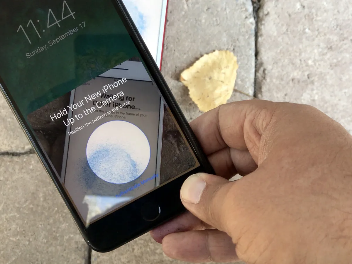
iOS 11 Automatic Setup
Since launch, you've set up Apple Watch by scanning a pattern on its screen with your iPhone camera. From there, it was just a few short steps before it was up and running. Now, thanks to iOS 11, you can use that same, simplified setup method for a new iPhone or iPad as well (and Apple TV with tvOS 11).

I love this. I'm not a fan of QR or pattern code scanning in general. It feels like outdated technology in an era where things like Apple Pay "just work". But, using the camera and pattern is a simple way to ensure both devices are in proximity — in your presence and under your immediate control.
Once the pattern is scanned and your passcode created and entered, peer-to-peer networking with transfer over things like your settings, iCloud Keychain, and personal content.
For years now it's been obvious that the traditional "Setup Buddy" system that walked you through the installation of a new iPhone or iPad was becoming far too long far too complicated and far too tedious to use. It had to ask you about privacy, Hey Siri, Touch ID and Apple Pay, and a list that went on and on.
And it wasn't clear how to fix it without hurting disclosure and discoverability.
Automatic Setup is that fix. You still have to do some setup, including services that want access to your location or require on-device security. But it's so much faster and better than the old way that I can't ever imagine going back.
For people like me, who have to set up multiple devices multiple times a year, because they have to write reviews like this, it's a godsend. Even for people who only set up one or two new devices every year or two, though, it's a major leap forward in speed and convenience.
iOS 11 Notification and Control Centers
Notification Center and Control Center have changed multiple times over the last few years. So much so that, compared to the other interface layers, they've always seemed more like works-in-progress. iOS 11 is no exception, with significant changes to both in order to provide a more discoverable, more consistent experience.
Notification Center has essentially been replaced with iOS 11's Lock screen. Pull down from the top of the screen (top center on iPhone X) and, like a cover sheet, you get the Lock screen interface with all notifications visible. They stay that way too, unless and until you act on them or choose to tap-to-clear them. (And you can 3D-Touch-to-clear all.)
(On Lock screen, they'll appear cleared if there haven't been any new ones since the last time you used your phone. Swipe up, though, and they'll all come back. That persistence should appease people who disliked everything being blown away every time they unlocked.)
From the cover sheet, you can swipe left to access the Camera and right to see Siri suggestions. These shortcuts are now identical regardless of whether you started on the Lock screen or accessed the pull-down from any other app on your device.

It works. Mostly. Being able to pull down Lock screen makes some spatial sense, though the true Lock screen fades more than pulls down. Reconciling all the animations might help there. It still confuses me sometimes as far as the security state of my device (Lock screen vs. glanceable information screen) but I think the consistency makes for a decent trade-off.
Swiping into Camera from Notification Center, the way you've been able to do from Lock screen for years, is handy. But it really highlights its just-as-longstanding inability to let you swipe back out of it. (It collides, and loses to, the Camera's use of the gesture for switching between photo and video modes.)
The contradictions here, and in many other areas of iOS, have no easy answers. Some don't even have clear better or worse options: They're judgment calls. Overall, Apple's made those calls well. But enough of them exist now — especially with iPhone X, that I'd love to see Apple tear it all down, start with a clean slate, and come up with a new spatiality and gesture navigation system that's as coherent as possible within, between, and across apps and devices. (Easy for me to say, I know.)

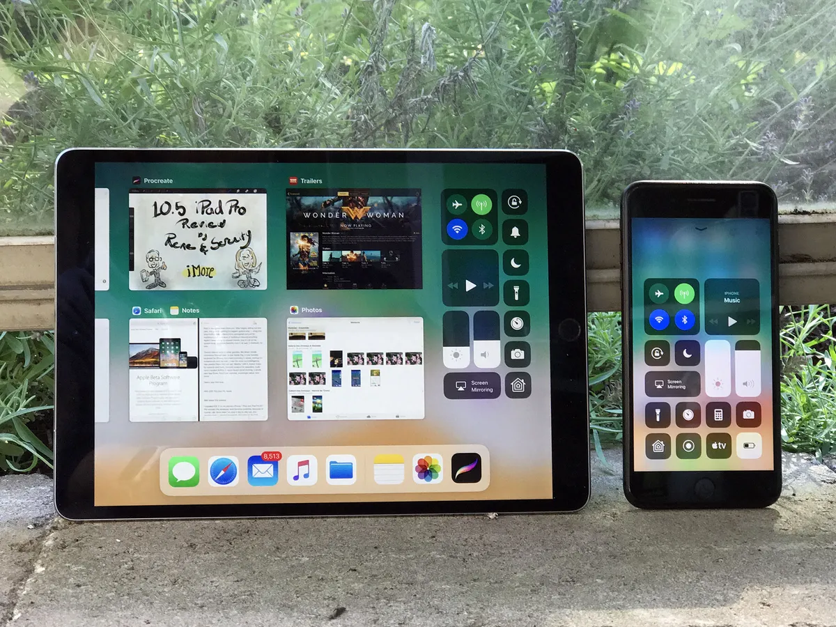
Control Center has gotten an even bigger change. Swipe up from the bottom (or the top right of iPhone X), and you get a single screen again: No more half-height, multi-pane layout to swipe back and forth through. I'm guessing enough people failed to realize there were multiple panes that Apple had to call a mulligan and go back to a unified sheet.
To fit everything in, Control Center now fills the entire screen on iPhone. (On iPad, it fills the right side of the new App Switcher.) And the controls themselves… they're everywhere.
While other elements of iOS have gotten bigger and less informationally dense, Control Center is the opposite. It's denser than ever. You can even customize it now in Settings > Control Center so you can have more and different controls. And that includes items from almost everyone's wishlists.
Top of mine is the built-in screen recorder. Previously you had to plug into a Mac and use QuickTime to grab video from your iPhone or iPad. Now, once you add it in Settings, all you have to do is invoke Control Center, tap the record button, go to what you want to record and, when you're done, tap the red banner to end and save the video.
Apple TV Remote, Low Power Mode, Voice Memos, Guided Access, Magnifier — the options are varied and truly useful. About the only thing still missing is third-party app support. (And the ability to reassign default apps, which would likely be needed to make it truly useful.)

3D Touch (or long press on devices without 3D Touch) on a button or control and it pops you into even deeper options, too. For example, the entire Now Playing and Home panes are now contained within the pop action of its audio controls and Home icon.
Discoverability is always a concern with that type of interface, but enough is surfaced that most people should find the rest, at least given time.
I'm not sure Control Center has gotten to its final, elegantly functional destination yet. But I like the way it's going.
iOS 11 Drag and drop
The biggest feature not introduced last year was drag and drop interactivity, especially for iPad. It was rumored, it was longed for, but not matter how often people said it was coming, it never quite arrived.
Until now.

This isn't the Mac drag-and-drop with a touch layer grafted on top of it. Apple didn't graft any old code or behavior here. This is drag and drop born for multitouch. A lot of multitouch.
It's another example of Apple's long-stated belief that the Mac should be the Mac and iOS should be iOS or, perhaps better stated, legacy and preconception should never hold back the future.
For a long time, Apple has been incredibly conservative, and sometimes almost mystical about how it used multitouch. Instead of using the multitouch field to enable tricks like hover states, Apple used it to detect which fingers were being used and reject incidental contact. Instead of creating complex, multi-finger and multi-directional gesture traced like incantations across the screen, Apple has stuck to the few, really intuitive ones that move quickly and cleanly across cardinal directions or best reflected direct manipulation.
With drag and drop, though, Apple is starting to let loose.
Previously, as my colleague Serenity Caldwell has pointed out numerous times, uploading images from Photos to iMore through the CMS was arduous to the point of being unusable. Now, it's arguably better and certainly more tactile and fun than on Mac. Functionality that didn't work on iOS before, like dragging to move elements on a web page, all "just work" now.
There are many things I love about Drag and Drop, but this one single-handedly just fixed a HUGE workflow problem I had on iPad: pic.twitter.com/1UuA7DUjqR— Serenity Caldwell (@settern) June 14, 2017
The technology is built in at the system level, so drag and drop works on both iPhone and iPad, although iPhone implements far, far less of it right now. On iPad, you get everything Apple's got.
Touch an element — it could be an image, an icon, a text selection, whatever — and it begins to float. Keep touching it and you can drag it around the screen and drop it anywhere else that will take it. That includes other parts of the app and even entirely different apps.
Tap other elements with other fingers and they'll be added to the drop stack. Walk your fingers so one touches before the other releases, and you can switch how you're holding the stack.
Start using your other hand and — holy wow! — you can four-finger pinch or swipe to change apps, or hit the Home button and pick another app, or use the split view app switcher, or… you get the idea. But there's more: Tap inside an app to start a new email or new note or bring up a folder or uploader or… I could just keep going.
It's Apple unlocking the full-on multi-finger multitouch, and it's glorious. Complex, sometimes requiring two hands and an iPad set down on a table? Yes. But glorious.
You can even use drag-and-drop multi-select to make rearranging Home screen icons a lot less tedious. Put them into jiggly mode, grab one icon, tap to add others, and then move them where you want them.
Mostly, you can drag and drop almost anything you can touch. Words or snippets of highlighted text. Pictures. Objects. Locations. Links. If it's data and can be packaged for dragging, it'll drag. There's enough "hinting" in the interaction model that you should be able to discover what's draggable quickly, and enough joy in the process that you should experiment and find all sorts of incredibly convenient use cases as time goes on.
Multitouch aside, there is another major difference between macOS and iOS drag and drop: the security model.
On iOS, only metadata — for example, the type of content you're dragging — is shared with an app you're dragging over. No actual data is handed over unless or until you actually drop it.
That's annoyed some who want to do things like preview changes on drag. It's annoyed them so much so, some have gone as far as to call the feature "drag and secure paste" instead of "drag and drop". Security and privacy are Apple's priorities, though. First, last, and always.
So, yeah, you can't preview a color change on drag but you also can't accidentally hand over a private photo or personal info to a dodgy app you just downloaded — or, you know, Facebook — as you're dragging over it to get to Files or Mail. Maybe a future version will offer secure previewing as well. Until then, though, I think Apple made the right choice.
iOS 11 Dock and multi-windowing
Despite my intermittent pleading, iPad still hasn't been given its own iPadOS interface layer the way Apple Watch and Apple TV were given watchOS and tvOS. That leaves iPad, despite its more expansive display, with essentially the same interface layer as iPhone. Though not entirely.
Two years ago, with iOS 9, Apple gave iPad multi-window multitasking. Now, with iOS 11, Apple's giving iPad better tools for using those windows.
It starts with a new Dock implementation. Instead of being anchored to the bottom of the display it's inset now, with rounded edges and a style that makes it look like it's floating. Functionally, it's just as unfettered. Dynamic now, the Dock will expand and contract to fit whatever apps you want to stick on it at any given time. It'll also present you with suggested apps and Continuity apps on the right.
If it's not already visible, you can drag the Dock up from the bottom of the display with a simple swipe. (It's usurped the gesture from Control Center on iPad just as Home has on iPhone X.)
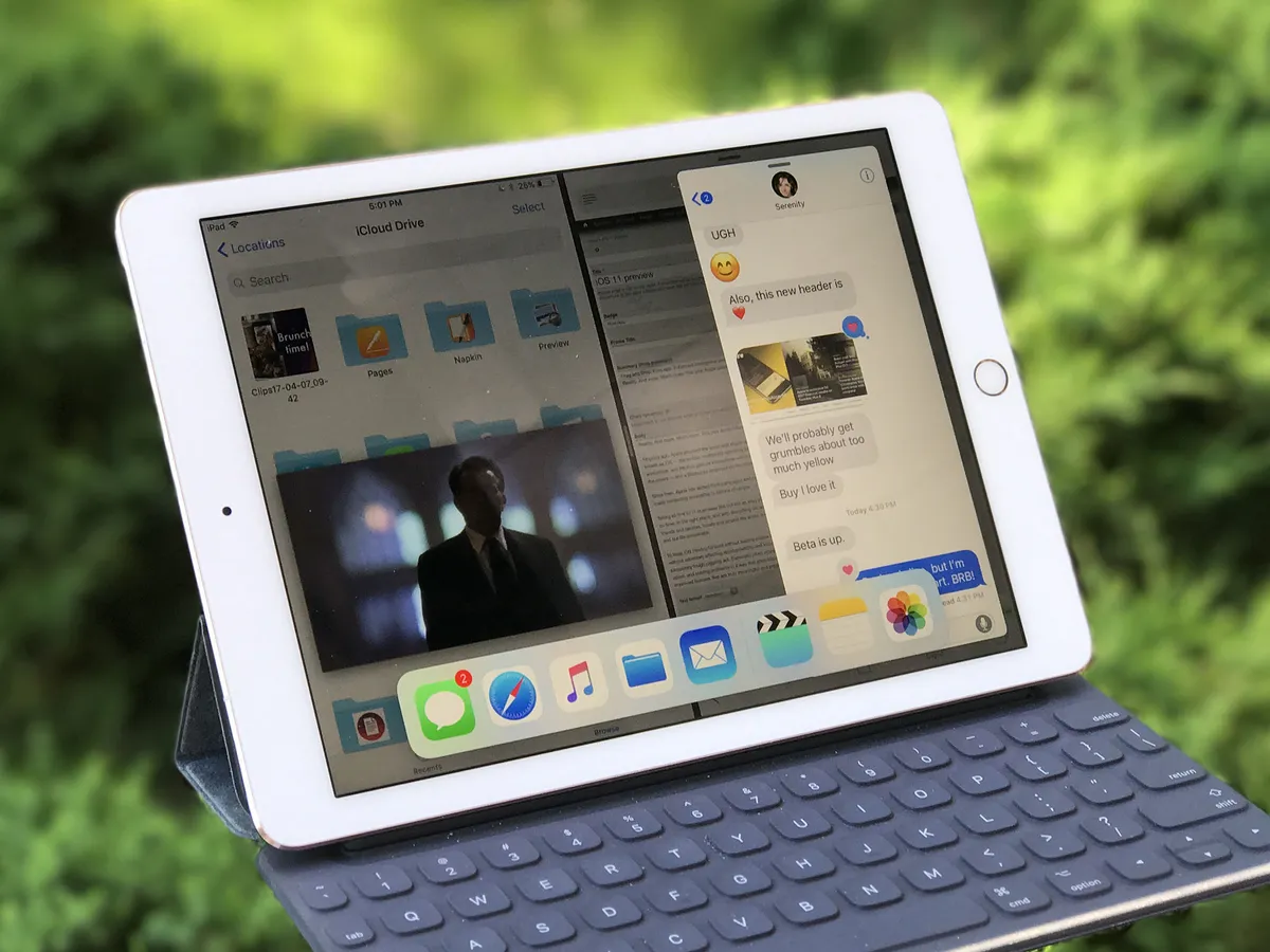
You can still tap icons on the Dock to launch apps but, now, you can also touch and hold an icon, drag it up, and drop into a new-style Slide Over, which also floats more than docks, and also has rounded corners. (UIKit can animate corner radius now — celebrate!) You can even swipe the Slide Over from side to side depending on how you want to work.
Flick down, counterintuitively, on the top of a Slide Over and it turns into a full-on Split View. You can even stack an additional Slide Over on top of a Split View interface. It works great, especially with devices that support 4GB of RAM, like the new iPad Pro models: The primary app in Split View will stay active along with the Slide Over interface, and even a Picture-in-Picture video, if you have one running.

When the Dock is visible, a second swipe up takes you into the new App Switcher interface. It replaces the old iOS multitasking interface with a more powerful version, providing the aforementioned Control Center icons top left, along with an iPad-style version of Spaces from macOS. There, you can not only find your recent events apps, but your recent Split View pairings, and quickly pop back to not only what you were doing — but how you were doing it.
(On iPhone, you still double-click Home to invoke the fast app switcher or, on iPhone X, swipe up from the bottom and pause. The 3D Touch firm swipe from the left edge is currently not enabled but, rumor has it, will return to iPhone 6s, iPhone 7, and iPhone 8 with iOS 11.1.)
You can't pin any pairings but the system does a great job persisting the ones you use most. Notes and Safari, for example, is almost always center tap for me. (It's the one I'm using right now, after all.)
It's not perfect yet: If an app isn't in the permanent or recent section of the Dock, there's no easy way to pull it up into Slide Over or Split View. (You can try using Spotlight in Notification Center to bring it up, but it stopped working for me in later betas.)
It can also take a lot of manual dexterity — and both hands — to get all the multi-finger multitouch gestures working just right, and more than a little time and repetition before it starts to become natural.
Then, the complexity of the mechanics fade and it starts to feel like you're dealing windows onto the screen just like you'd deal cards onto a table. Terrific.
It's so cool it makes the Split View introduced in macOS a couple of years ago — and neglected ever since — feel absolutely primitive by comparison.
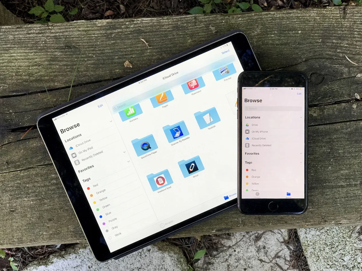
iOS 11 Files
I've been asking for a Files.app almost every year since iOS 4 made it obvious that per-app silos created as many problems as they solved.
Don't get me wrong: Traditional comp-sci file systems remain confusing and unapproachable to the mainstream, which is why so many files get dumped onto so many desktops. That said, by not having a relatively flat, easily searchable repository, iOS has been creating just as much confusion and anxiety.
All I've ever wanted was an analog to Photos.app and the ImagePicker API. It's a great model for the mainstream. iOS got DocumentPicker a while ago and now, finally, it's gotten Files.app as well.
On the surface, Files.app makes it easy to organize and find all the documents on your iPhone and iPad. The initial hierarchy is flat, but you can create and nest folders if you really, really want to.
Thanks to drag and drop, it's delightful to move stuff around both inside Files.app and between apps. Folders are spring-loaded, for example, so you can easily drag a file from one right into another — or a sub-folder beneath it.
You can toggle between icon view and list view, pin your most important content, and tag groups of similar content together — by dragging it over the tag color in the sidebar!
What's coolest and most important about Files.app is that Apple has taken not just its own silos, but the ones that often complicate traditional file systems, and attracted them away. What you get is a unified view of not just the files local to your iPhone or iPad, but of your iCloud Drive, and other online providers as well, including Google Drive, OneDrive, and Dropbox. So, you can truly organize and find all your files, all in one place. (Which is good, because Files.app also replaces the previous iCloud Drive app.)
The default Recents view is, perhaps the quintessential expression of that. All your latest stuff, all right up front. (You can even get to them from the Home screen or Dock thanks to 3D Touch shortcuts.)
Nothing is copied, conflated, or jumbled together: Each storage system remains separate and distinct. But you enjoy the efficiency and simplicity of seeing and using them all together.
iOS 11 Camera and Photos
Years ago, the cliche was that Nokia had the glass, Apple had the silicon, and Google had the servers. In other words, a Lumia could capture great images, Apple could calculate great images, and since Google never knew what hardware was available on any given device, they'd just suck everything up to the cloud and make the best they could from it there.

Now, though, Apple is fielding fusion lenses and doing local computational photography, where machine learning, computer vision, and a lot of smart programming start to produce images beyond what any one of those processes could do alone. (And since it's done on-device, you don't have to give up all your private photos to Apple just to reap the benefits of the processing — your valuable data stays yours.)
Portrait Mode on iPhone 7 Plus was the first mass-market application of fusion and computational photography that I'm aware of. On iOS 10, it came with fairly strict lighting requirements. On iOS 11, though, better optical and software-based stabilization, and shoots with high dynamic range (HDR), which dramatically improves low-light and high contrast performance. For extreme low-light situations, iOS 11 will even let you do Portrait Mode with the LED flash.
Noise is still an issue, but Apple does a lot with the "grain" to mitigate it. So much so that I often don't notice the noise at all at first — I'm too busy marveling at the subject. Reflections can also still be problematic, but it's starting to improve on that as well.
It's more than just faces now too. Last year, you could already capture flowers, coffee cups (so many, sorry!), and more but you could still tell it was a face-first feature. Now it feels like it's got wider ambitions. Officially. For example, grabbing onto a chain link fence and blurring the background behind it.

Apple has also switched from the ancient JPEG (joint photographic experts group) format to the new HEIF (high-efficiency image format) in iOS 11. To capture it and hardware encode/decode HEIF, you'll need a recent device though — A10 Fusion-powered or later, which means iPhone 7 and iPad Pro (2nd Gen) at the least.
When moving images around, Apple will try to maintain HEIF formatting for quality reasons but, if you ever try to send a HEIF image to an older device that doesn't support it, or Apple can't tell if the device you're sending it to is compatible, the system will automatically convert to JPG first. Compatibility beats efficiency.
The efficiency in HEIF's name works out to about 50% space-savings over JPG in your library. It comes at the expense of slightly longer encode times but nothing in life, and certainly nothing in imaging, is free. For photos on iPhone, though, the process is already so fast I've never noticed a difference.
What's even cooler about HEIF is that it can store multiple image assets in the same container. For example: In iOS 10, when you shot on an iPhone 7 Plus in Portrait mode, the Camera app would spit out two images — one normal, and one with the depth effect burned in. With HEIF, the depth data for Portrait Mode is retained but bundled into the same file.
The advantage to that is most apparent in photo editing, where filters can now apply different effects based on the depth or motion data. Not just on iPhone 7 Plus either. As long as the effect information is bundled into the HEIF, iPad and Mac can get every bit as "depthy" with it.

So, for example, the new filters in Camera and Photos, can apply different shades and tones based on the depth data in the photo.
Those filters have been rethought not to duplicate what you typically see on social networks but what you'd find in more classic photography: Vivid, Vivid Warm, or Vivid Cool, which play on vibrancy; Dramatic, Dramatic Warm, or Dramatic Cool, which toy with contrast, and Silvertone which rounds out the previous Mono and Noir filters with something a little more high-key.
Silvertone is probably my favorite of the new "depthy" bunch.
Apple's also been steadily improving Live Photos as well over the last couple of years. First and foremost, the quality you get from the 1.5 second before and after animations are much-improved. So much so that Apple can start to offer some really cool new effect options.
Namely, Loop, Bounce, and Long Exposure.
- Loop takes the 3 seconds of Live Photo animation and fades from end back to beginning, so the video plays over and over and over again, in an endless cycle.
- Bounce takes the animation, plays it forward, then plays it back, like a perpetual ricochet.
- Long exposure takes the animation and shows all frames at once, so motion blurs and light stretches out across the frame.
HEIF also works with Live Photos. Instead of a separate JPG and MOV (movie) file, you now have both the still/key photo and the video bundled into one file. That means those effects are also non-destructive, and you can go from bounce to loop and back again any time you like.
In all cases, the effects are intelligent and try to lock position on static elements so the moving elements become even more dynamic in contrast.
Sure, these types of effects have been available in apps like Instagram and Snapchat for a while, but they were also stuck in those networks. If I wanted to make a fun bounce, I had to do it in Instagram and either share it with everyone or with friends on Instagram.
By adding effects into Live Photos, I can share them outside of my social networks — including with family and friends that want no part of the Facebook or Snapchat scenes.
That bounce of my friend and I tapping champagne glasses at my birthday? That went straight to them over iMessage. Securely. Privately. Not for the world or for the giant data harvesting companies. Just for us.
Especially when it comes to Faces and sync.
When Apple initially re-deployed facial recognition and tagging last year, the company said syncing would come later.
Well, later is now. And the reason it took so long is that Apple wanted to provide the convenience of sync while maintaining the privacy and security of on-device processing — Apple doesn't want to know who your friends and connections are, and I'm supremely thankful for that.
So, what Apple's doing is interesting. To enable face detection, you have to start selecting people you know and then identifying them. At that point, the on-device machine learning and computer vision takes over and starts to add more and more pictures of the identified people to the pool.
When syncing, Apple is only moving over the data you yourself identified. None of the machine learning or computer vision relationships that were built around it. Just your "truth". Then, the synced device rebuilds those relationships locally.
In other words, I tag pictures of my mom on my iPhone, it finds other pictures of my mom on my iPhone to add to her Faces folder on my iPhone. The pictures I tagged are also synced to my Mac, which then also finds other pictures of my mom on my Mac to add to her Faces folder on my Mac.
Apple will have to prove that this implementation works well enough that people who want no part of the massive data harvest that is Google Photos will still find it useful enough to use, and that'll take a while post-launch to really shake out.
Still, privacy is good and options are good, and options for privacy are great.
The video version of HEIF, and the base codec technology, is HEVC (high efficiency video codec) — an ugly way of saying H.265. Compatibility is slightly wider for HEVC. Any iOS device with an A9 processor (iPhone 6s and iPad Pro or later) can encode and decode 8-bit HEVC. Devices with A10 Fusion (iPhone 7 and iPad Pro 2 or later) can encode and decode 10-bit HEVC, which translates into HDR (high dynamic range) video.
HEVC offers a 2x improvement in compression over the previous H.264 codec. Apple will similarly maintain HEVC internally whenever possible but will fall back to H.264 if you try to share a video to a device that has no support or there's no way to know if it has support or not.
There's a lot more in Camara and Photos in iOS 11 as well. QR scanning, for example, will let you quickly capture and act on codes. Memories, which was a surprise hit with mainstream users last year, is getting several new types, including: pets, babies, birthdays, sportsball, outdoor activities, driving, night life, performances, anniversaries, weddings, "over the years" (aka "this is your life", "early memories" (aka "glory days"), visits, gatherings, and the one that scares and delights me almost as much as pets — meals.
There's even a stealthy level that fades in when you've got the grid overlay enabled and you go to take a top-down photo of your food, coffee, everyday carry, etc. It's a glorious touch that helps the already composition-obsessed absolutely nail the shot.
iOS 11 iMessage and Apple Pay
iMessage is the most popular app on iOS and, like messaging in general, is increasingly becoming a platform in its own right. That's why Apple has been focusing on messaging almost as much as it has photography: It wants people stuck to iMessage so they remain stuck to iPhone, iPad, and other Apple devices. Inline stickers, effects, and apps were a big part of that strategy over the last few years and continue to be refined in iOS 11.
iMessage has a new interface for choosing apps and stickers which I'm still neither here nor there about. It's better than before but still feels like it clutters up the messaging experience. I don't know a better way to solve for the increasingly cluttered messaging experience in general, though. So, I'll just keep holding to hope that even better is still on the horizon.
There are some new screen effects, including echo which lets you set everything from a chicken head to poop emoji to knives to eggplants (yes, eggplants) swirling around the screen. It's as delightful and terrifying as it sounds.
There still aren't any bubble effects for setting a message on fire or freezing it cold, which I'd love to see. And I still wonder how or even if Apple will keep up with Snapchat and Instagram who seem to offer ever-more-outlandish filters weekly if not daily.
When iPhone X launches in November, though, we will have Animoji to entertain — and spam — our contacts with.
Also on the waiting list is iMessage sync. Apple originally announced the feature would be coming to iMessage for iOS 11 at WWDC back in June but it was pulled at some point during the beta process. I'm hoping it returns in iOS 11.1 or some future release because the implementation looked clever:
Previously, each device got its own unique end-to-end encrypted copy of a message that Apple's servers would attempt to deliver for a week or so and then abandon forever. It was great for security but not so great for convenience and consistency. Over time, invariably, some devices would have some messages and others, especially newer ones, wouldn't.
I was curious how Apple would solve this because the last thing any privacy-conscious person — or Apple itself — wanted was some unencrypted web repository sitting online, ripe for the plucking.
With iMessage sync, all messages remained end-to-end encrypted and, for all intents and purposes, inaccessible to Apple. They were simply collected on the web, in their encrypted form, so Apple could ensure a consistent delivery and experience across devices.
Once the feature actually ships, we'll see if any of that has changed and how well the system holds up to the scrutiny of the infosec community. If Apple is going to stick by its privacy-first policies, though, it's going to have to stick with delivering on them as well.

Another iMessage feature that still has to ship is person-to-person Apple Pay. It wasn't promised for release but for later this fall, so Apple still has some time left. And I'm really hoping they nail it.
I'm lucky to live in a place that's soaking in Apple Pay. I use everywhere I go. So much so that when I can't use it it's like a utility has gone off. Like I've lost power or the internet. I don't carry cash with me anymore and I barely carry cards. The only exception, of course, has been swapping funds with friends and family. They don't exactly walk around with contactless payment terminals around their necks. Most, anyway…
For that, we've had to resort to quick bank machine runs, using PayPal like it's 2007, or relying on a third-party service and app, which isn't always available or set up by everyone. All the while hoping Apple would bring person-to-person payments to Apple Pay. And now they're starting to.
Even though person-to-person Apple Pay is still a short way off, I have had the chance to try it at a demo last month. And it worked well.
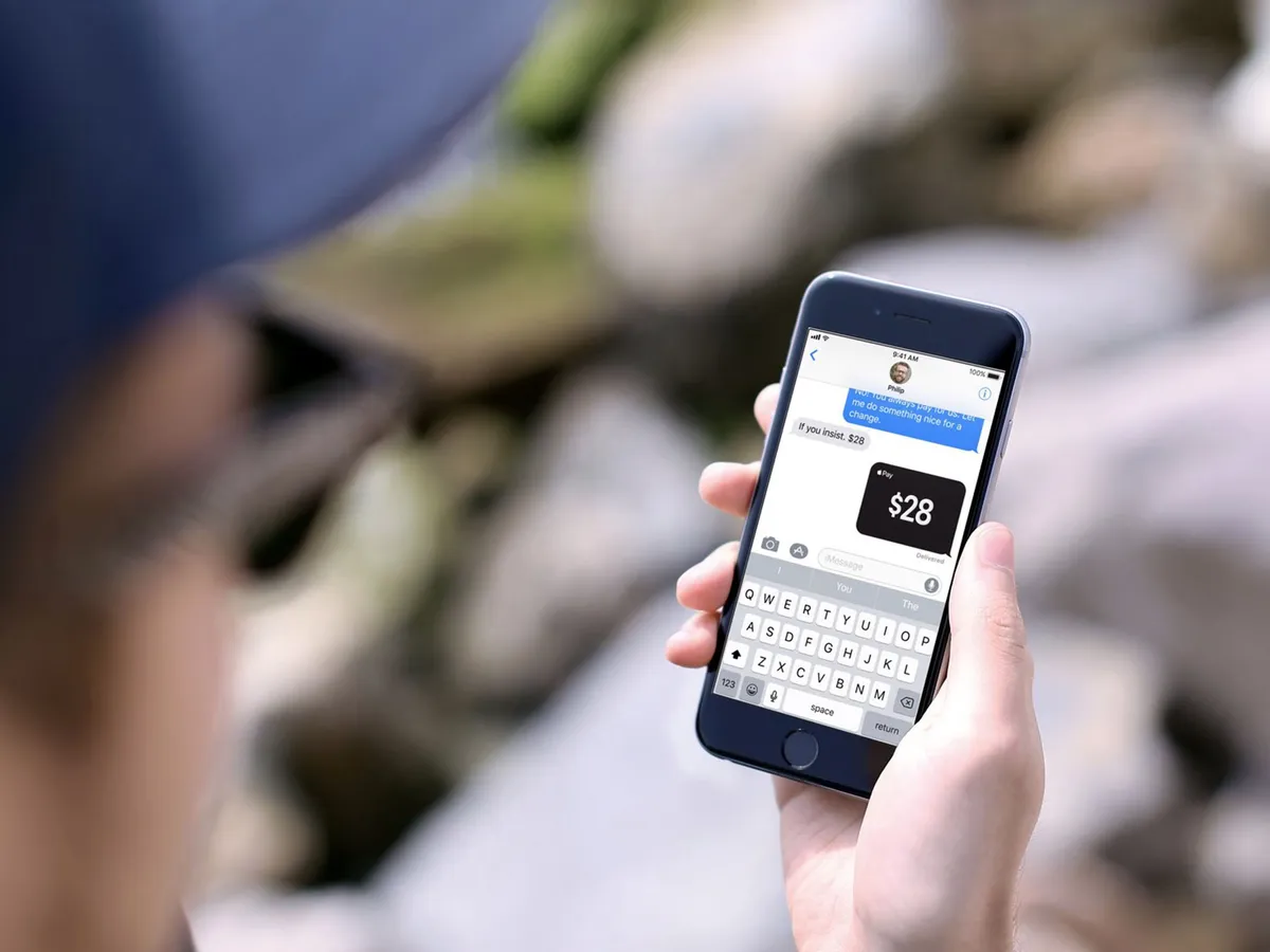
You have to approve it first, so someone can't simply spam you with requests for cash and hope to trigger an automated response. (Sorry, colleagues who've tried!). Once it is approved, though, it works intelligently to detect potential triggers and offer itself when and as needed. For example, if Lory Gil messages me that my share of beverages is $42, iMessage could ask me if I want to send it to her right there, right then.

Sending money is also a breeze. You simply tap it out in iMessage or tell Siri, Apple's intelligent voice assistant, who you want to send money to and how much.
If and when you receive money, it goes into an "Apple Pay Cash" card stored in Wallet where you can quickly and easily buffer funds until you decide to make purchases or withdraw to a traditional account.
Being tied to Messages might be inconvenient for people who live in a different service, like WeChat or WhatsApp. For people already in the Apple ecosystem, especially those like my friends and family who only ever use iMessage, it'll be all but effortless. Better still, it's one less service to have to maintain — and one less security and privacy vector to worry about.
That's because, like everything in iMessage, person-to-person Apple Pay is end-to-end encrypted and Apple has absolutely no interest in harvesting, aggregating, and profiting off your transaction data. Who you get money from and who you send money to is your business, not some massive online social search company. And, frankly, that's become just as if not more important to me than the service itself.
Person-to-person Apple Pay will be U.S. only at launch, which is a huge but expected bummer to people like me who live outside the U.S. Hopefully, it'll roll-out to more countries and quickly. Apple's scale generally helps push things out and make them mainstream. Because I want it yesterday.
iOS 11 App Store
Ten years after it was first introduced with iOS 11, the App Store has finally gotten a complete re-imagining. It's more than a makeover because it's more than interface deep: It's a complete rethinking not just of how to present apps for people to browse and search, but how people browse and search for apps.

It starts with the new Today tab. For years Apple has had an amazing team of editors working on surfacing, curating, organizing, and arranging the best of the best apps. But their work was constrained to weekly feature blocks. Now it's open to daily features.
An endless vertical scroll filled with stories, broken up by text, images, videos, and lists, it's rich beyond rich and instantly forces you to reconsider everything you thought you knew about the App Store. It almost reminds me of thumbing through stacks vinyl records, seeing the album art and type fan by. This isn't a digital shelf anymore. It's a multi-faceted digital experience.
There are features, like "Meet the developer", "Our favorites", "Gaming 101", "Behind the scenes", "Collection", "How to", "DIY", and "The daily list". There's also an "App of the day" and "Game of the day". Each gets its own card in the deck. Tap a card and it springs up excitedly to fill the screen. And, where previously App Store editors were limited to tiny blurbs, if that, they now have real space for real prose. It's almost as though Apple has started its own app blog. (That's fine. Everything's fine. We need the competition!)

It's a jaw-dropping achievement, both in terms of the App Store app itself and the Today content that fills it. But it's also a jaw-dropping increase in the scope of the App Store team's workload, text, graphics, and video all. I'm legit exhausted just thinking about how much consistent effort they're going to need to put in, day after day, month after month, year after year, to maintain it.
And I'm curious to find out just how much return the App Store gets on this incredible investment. Today, after all, is a destination. Destinations are great, especially when we're bored and simply want to find the next cool thing to pass our time. But, increasingly, destinations have given way to demand. We want therefore we search. Boredom is less frequently our problem. Finding what we want in a sea of potentials, that's our problem.
Luckily, App Store is getting better at that as well. Gone are the days when searching for "Twetbot" returned no results. Now, it properly returns not only "Tweetbot", but other apps by the same developer, and other apps around the same service (Twitter).
There are, at long last, separate tabs for Apps and Games, so popular apps are no longer buried under the always more massively popular games. That's fine again for browsing, and I'm super glad Apple's done it. But I think we're already in an era where most people come to the App Store not from the tabs but from elsewhere on the internet. They see an app or game on the web or on social and they tap or click straight to it.
Those app and game pages have been redesigned as well, though the interface still struggles to cleanly contain all the elements. (And the use of the "more" (•••) button for pulling up the Share Sheet still causes me to do a double-take.)
As Today builds up more content and that content propagates down to the app and games pages, they should become more visually interesting, engaging, and alive as well. That'll take some time, though.

The App Store can even offload apps and games you haven't launched for a while to free up space on your iPhone or iPad. No data is deleted or lost, and you can re-download them at any time. I haven't been able to tell if any of my apps have been offloaded, so it's either taking its time or working brilliantly.
It's clear the redesign was a labor of intense love from Apple, and that Today is evidence of the company's extreme commitment to the platform and developers.
And I'm hoping intensely it pays off for all involved.
iOS 11 QuickType Keyboard
Apple's doing a couple cool things with the iOS keyboard this year. The first is a one-handed keyboard for iPhone. It's not the first time Apple's worked on solving for wider phones but it's the first time they've been happy enough with the solution to ship it. And I'm thankful for that. I've been waiting for it for a while.

There are both left and right-sided versions of the one-handed keyboard. You access them through the same "globe" button that you use to switch keyboards or get to emoji. Getting back to the standard keyboard is even easier. You simply tap the huge arrow on the opposite side.
I wish it were even easier though. I'm guessing edge gestures to invoke and switch the keyboard to one-handed mode and from side to side — which is how split keyboard has always worked on iPad — don't scale down as well. Still, I'd love it if Apple could figure it out since I want to move in and out of one-handed mode a lot.
The second big change is a new "flick"-style keyboard for iPad. It lets you enter alternate characters like numbers and symbols by simply flicking down on the key.
It has an almost old-school typewriter feeling to it but I'm still wondering if flicking down – as opposed to flicking up — was the best choice Apple could make here. Because the alternate characters are not only rendered at the top of the main characters but the area I'm writing on is spatially above the keyboard as well, I still find myself flicking up on occasion. (I have the same problem with Slide Over apps and pulling down rather than pushing up to dock them into Split View apps.)
Like autocorrect, flicking is something you have to get used to and learn to trust, but once you do you can enter mixed text, including passwords and addresses, faster than ever.
Especially since Siri has been amped up to prompt for even more information types, including places, movies, recently viewed items, ETAs, and more.
In my experience, it doesn't work all the time, or at least all the times I'd expect it to, which is slightly frustrating. When it does work its delightfully convenient.
iOS 11 Notes
Notes is my Mind Palace. With Sync. I dump everything I'm working on and want to keep top-of-mind into Notes and it shows up everywhere so I can find and use it anywhere. I do wish I could switch it from rich text to plain text mode — because, nerd — but otherwise, it's become one of my most-used apps. And in iOS 11, it's gotten even better.
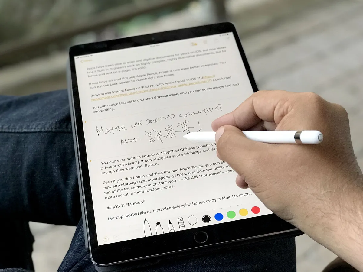
Apps have been able to scan and digitize documents for years on iOS, but now Notes has it built in. It doesn't work on highly complex, highly illustrative documents, but for forms and text on a page, it's solid.
If you have an iPad Pro and Apple Pencil, Notes is now even better integrated. Instant Notes lets tap the Lock screen with your Pencil and start writing. By default, it kicks you right into a new note but you can tweak that in Settings so that you land on the last Instant note you created or the last note you viewed in the app.
In Notes, you can nudge text aside and start drawing inline, so you can easily mingle text and handwriting. You can even write in English or Simplified Chinese (which I can do at approximately a 1-year-old's level!). It can recognize your scribblings and let you search them as though they were text. Swoon.
If you don't have an iPad Pro and Apple Pencil, you can still benefit from the new strikethrough and monospacing styles, and from the ability to pin Notes to the top of the list so really important work — like iOS 11 reviews! — never gets lost under more recent, if more random, notes.
iOS 11 Screenshots and Markup
Markup started life as a humble extension buried away in Mail. No longer. Now, it's everywhere. Screenshots started off as a debugging feature kept alive because Walt Mossberg told Steve Jobs it would be useful for media. Now, they're front and center and tied right into the new Instant Markup system.

Take a screenshot and, instead of it disappearing away into your photo deck, it persists at the bottom left of the screen. Tap on it, and it takes you right into the Markup interface where you can add feedback or, you know, send everything from snarky comments to naughty annotations. (Who needs InstaSnap, right? Just markup responsibly, please, people.)
The overlay interface is at the same time super convenient and kind of annoying. When you want to act on a screenshot immediately, it's right there ready and waiting for you. When you don't, it's still right there, covering the screen, and harshening your Feng Shui. At least until you swipe it off-screen and away or wait a few moments for it to fade. There's no way for the system to know when you actually want a screenshot immediately, and when you're snapping away for later use, so it feels like Apple chose the best implementation possible here.
If you have an iPad Pro and Apple Pencil, you can use Markup even more precisely and easily — simply touch the tip to a document in Files or Mail and annotate away.
Giving instant access to screenshots and making Markup ubiquitous has made the act of capturing, commenting, and sharing visual ideas almost muscle memory for me already. And that makes it almost invaluable.
iOS 11 Siri
Apple was first-to-market with a mainstream digital assistant but the company's lack of early focus and acceleration has allowed Google, Amazon, Microsoft, and others to catch up and, in many people's opinions, race ahead.
Over the course of the last year or so, I've been wondering if Apple wouldn't benefit greatly from a public-facing VP of Siri Experience who has only one job — to sidestep everyone and everything else and make sure Siri is the best damn assistant on the planet, period. Much as Apple does for physical products like iPhone, and much as Phil Schiller has done since taking up that kind of roll at App Store. A little while ago, Apple did something pretty close: The company moved responsibility for Siri over to Craig Federighi's software engineering organization.
Just like it took a while before we saw the App Store pick up speed under Schiller, it'll probably take a while before Siri picks up speed under Federigihi, but iOS 11 is already off to a good start.
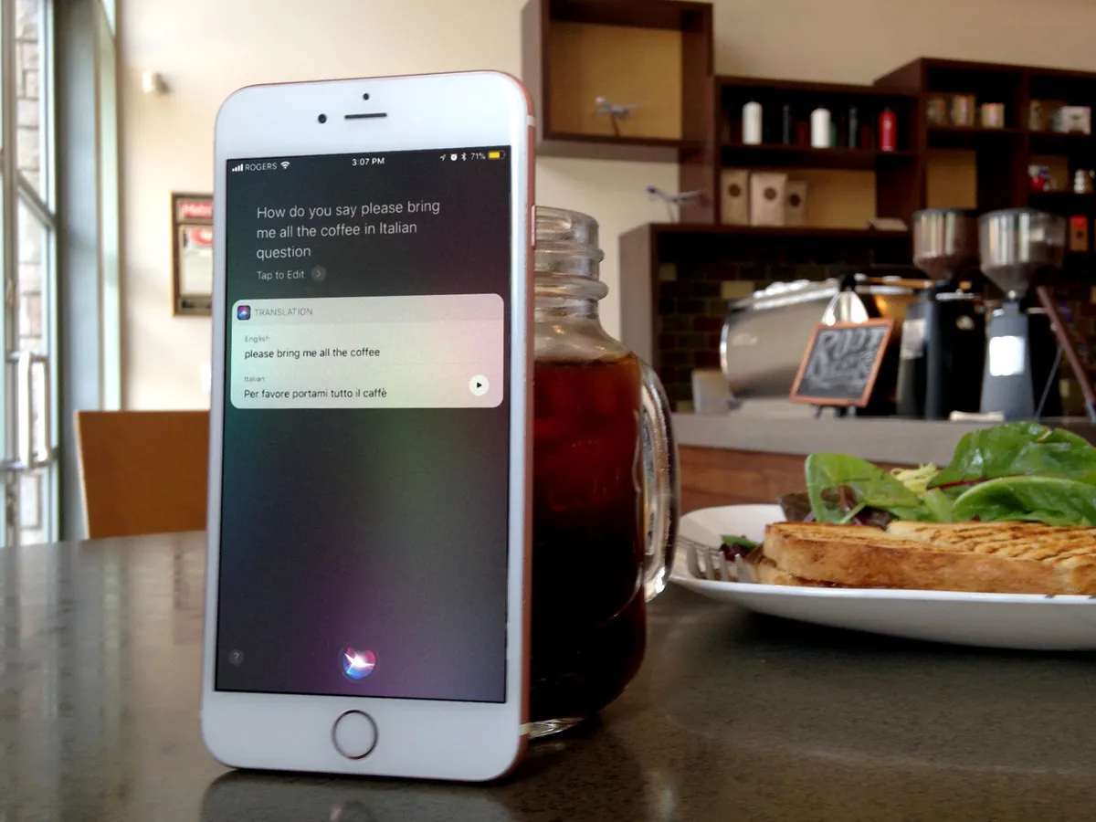
New features include a more natural voice with machine-learned inflections and intonations. There's also support for translations from English to Chinese, Spanish, French, German, or Italian. And, something else I've been hoping for over the last few years: the ability to type to Siri for when speaking is inappropriate or impossible. (Though that feature is currently tucked away under Accessibility.)
Siri will also sync what it's learned about you between devices. It doesn't keep a profile of you or your relationships on Apple's servers, the way some other companies do to harvest and monetize your personal information. Instead, it syncs securely, with end-to-end encryption between your devices. Apple doesn't have — and still claims not to want — your data.
New SiriKit domains include task managers and bill payment. Apps can use them to hook into Siri and provide functionality based around a wide range of intents. Still, only two new domains in a year is disappointing. Especially when it doesn't include media domains for music and video. I need to talk to Spotify and Netflix.
Inconsistency remains the biggest frustration. When you ask for something and it just works eight out of ten times, but the other two times it returns something incomprehensibly ridiculous, it's jarring. As someone who uses Siri all day, every day, for everything from controlling my home to dictating my work, if Apple's server-side Siri team did nothing else but stamp out aberrations and improve consistency over the course of the next year, I'd be ecstatic.
The Suggestions interface has also been expanded to include text in Safari, stories from Apple News, and flight status.
There's also a new Siri animation at the bottom of the screen. It's all futuristic and round, which makes it look a lot like Siri on top of Apple's upcoming HomePod. Badass.
iOS 11 ARKit
Screens are great. I love screens. But having to have a screen for my wrist, my pocket, my lap, my desk, and my wall, never mind several of each, gets expensive. One day I hope to have a simple marble-sized device that I keep on me — or implanted in me, shudder — and it constantly authenticates my identity locally and syncs my information with the cloud. Then shows and tells me everything and anything I want, whenever I want, through the infinite screens of augmented reality (AR). That might sound like science fiction, but I'm already seeing a glimpse of that future today, thanks to Apple's ARKit.
Unlike Google, which released a personal screen prototype called Glass and later a phone-based platform called Tango, and Microsoft which made a full-on mixed reality visor called HoloLens, Apple decided not to put the augmented device cart before the platform horse. (I'd guessed as much before WWDC.)
Thanks to the popularity of iPhone and iPad, that instantly gives them not only hundreds of millions of screens to target, but the deepest pool of developer talent on the planet to figure out and test the first use-cases.
Apple takes care of a lot of the heavy lifting up front. ARKit handles figuring out the planes, the lighting, the scaling, and keeping it all as anchored in time and space as possible. With the True Depth camera on iPhone X, ARKit will even handle face mapping. (See Rene as poop emoji, above.)
That lets developers create compelling, immersive AR experiences without having to create all the technology for AR around it. In other words, they get to hit the AR ground not just running but running like The Flash.
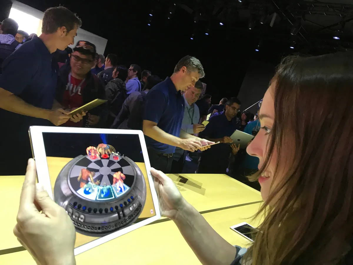
I've had a chance to try out a bunch of ARKit apps in various stages of development over the course of the last month or two. Some are upfront about the setup mechanics and tell you to move your iPhone or iPad around while overlaying the dot grids that map the real-world planes to the digital objects that will occupy them. Others gamify the experience, telling you to catch or find something while stealthily scanning as you do. I find both approaches fascinating.
Many of them do some variation of just what you'd expect right now: Let you place rendered objects in the environment, be they chairs on your floor, lipstick on your face, castles on your coffee tables, or starfighters in your driveway, and then inspect and interact with them for education, commerce, or just plain fun. Others, which let you do things like opening a door in a real library to access a fantasy or far-flung-future library, are brain-boggling.
Like with any framework Apple introduces ahead of first-party products and software, though, it'll take some time for the augmented dust to settle, the obvious realities to fall away, and the truly transformative experiences to emerge.
For now, though, I expect I'll be spending the better part of next year with AirPods in my ears and an iPhone or iPad in front of my face, ARKit augmenting my reality beyond anything I can imagine now.
And I can't wait.
iOS 11 Core ML
Machine Learning is basically Tinder for computers: Yes. No. No. No. Yes. Yes. No. Yes. No. It's how Apple trained the Neural Engine block on the A11 Bionic chipset for iPhone X, how it taught Photos to recognize mountains without having to suck up all your personal photos, and how Siri is getting its new, more naturally inflected voice.
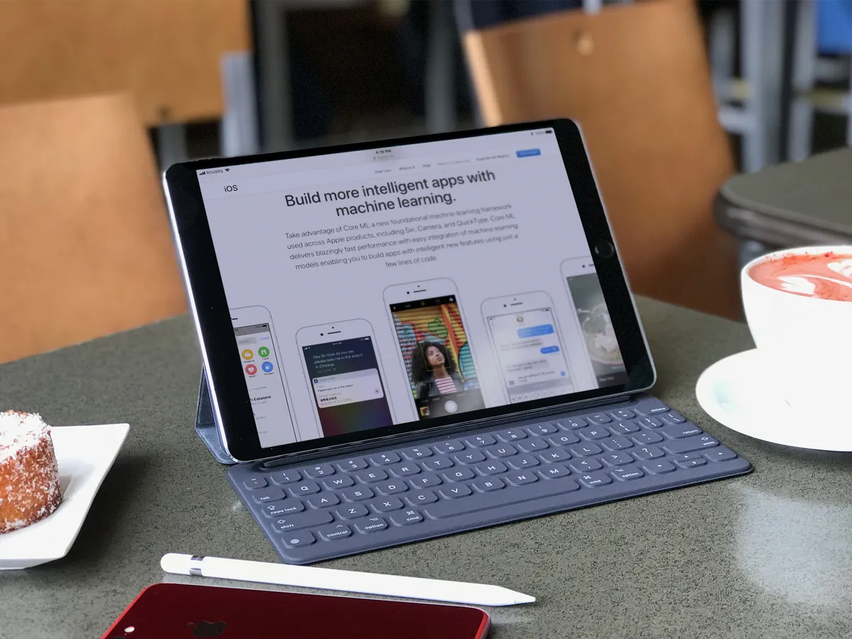
Core ML is how Apple bundled all that up and made it available to developers. Like ARKit, it means apps can access the power of machine learning without their coders having to expend the time and effort of building out all the frameworks all by themselves. It's also been called PDF-like, in that Core ML can ingest a wide range of different ML models, serving as a common ground.
There's also a Vision application programming interface (API), to apply Computer Vision, to apps. That likewise lets apps ingest and understand photos without having to engineer the process themselves. And a Natural Language Processing API for ingesting and understanding words and phrases. (There's even GamePlayKit for learned decision trees in games.)
All of this technology accomplishes the same basic thing: It lets Apple handle the grunt work so developers can concentrate on what makes their apps unique and compelling.
And that's kind of what ML, CV, and related technologies do for us as well.
I've gotten to try a few Core ML-based apps over the last couple of months as well. The best ones do a lot of work behind the scenes so that you have less to do in front of the interface.
For example, let's say you're selling your house and you want to show it off as best as possible. You may not have done all the research or gotten all the experience necessary to know which photos do precisely that. But an ML model sourced from massive amounts of real estate agents might. So, you load up the dozens of photos you took, the CV framework figures out what they all are, and the ML model arranges them so the bright, welcoming living room is up front and the darker, smaller bathroom is buried third from last.
You can tweak from there but you no longer have to start from scratch and do all the grunt work yourself. The machine has done it for you because it was trained to do just exactly that for you.
Yes, I realize we're starting to talk about devices more like pets than like objects, and yes, Terminator and Matrix have made sure I'm suitably creeped out by that. Computers have always been about convenience, though. And Machine Learning is the next leap forward in convenience.
iOS 11 Miscellany
iOS 11 is one of Apple biggest releases to date and that means it's chocked full of new and updated features. Everyone will have their favorites and the ones that are most impactful to their own workflows and experiences. Here are some of the bigger ones.

Apple Music is becoming more social but without any of the baggage that came with Ping or Connect. You can simply follow people and be followed, see what friends are listening to, and jam along as you do. I wish App Store would add this so hard.
Podcasts, which has long been tied to but seldom been in sync with the Music app, has caught up again with a big, bold, and beautiful redesign all its own. It looks and works great. Which is good because, thanks to the continued lack of SiriKit support for media, it remains the only fully integrated option on iPhone and iPad.
The Maps app is getting indoor mapping for malls and airports. Just a few to start, because the process is arduous, but more on the way. Lane guidance, light guidance, and speed limits are also being added to navigation — and to CarPlay — hurray. And yeah, you can drag and drop from and to Maps. Awesome.
There's a new Do Not Disturb while Driving feature that I think is important, especially as more jurisdictions pass much-needed distracted driving laws. I'm not sure DND is the right solution, though. It's so cut off it leads me to believe many will choose to ignore it. Maybe that it exists is enough. Still, I'd like to see Apple do what Google did with Android Auto and make an iPhone version of the CarPlay interface available — minus all the infotainment integrations, of course — to anyone with a car mount. That might just keep you safe even if you need to stay connected.
HomeKit can control speakers — interesting, with the coming of Apple's HomePod — as well as sprinklers and faucets. There are also expanded triggers, so you can automate better, and easier accessory setup via NFC and QR code scanning.
Speaking of HomePod, AirPlay 2 will let you do multi-room audio with a shared Up Next queue. Developers can add support for it to their own services and devices. It might take a while before we see that support, which means it might take a while before AirPlay 2 actually manifests in a useful way, but hopefully not too long.

The News app is more personal, smarter, can show video on its widget, and gives breaking news more attention. It's still not available outside its tiny handful of launch countries, though, which is incredibly disappointing. Apple pushed Apple Music out to 100 countries on day one. I'd love to see even a score or two more for news some two years later.
Mail has top hits, which I'm also still not sold on. It's convenient when its engagement engine nails exactly what you're looking for. Trouble is, I'm mostly looking for stuff like order info and fringe emails that I'm least engaged with. I'm a dinosaur, but I think I preferred my raw list of results.
Health can now sync your data between devices, and that sync is enabled by default in iCloud Settings. Lack of sync was one of biggest headaches for users switching between or upgrading devices, so that's great to see.
Safari now uses Machine Learning to try and prevent web advertisers from tracking you across multiple sites. It won't mean less ads but it will mean ads won't be able to gather as much information about you, both for advertisers and for targeting ads. Google's AMP proxying is also being stripped out when you go to retrieve a link. Thank goodness.

There's a new Accounts & Passwords section in Settings which, in addition to serving as a single, unified location to get to your iCloud, Google, Microsoft, and other services, provides a list of your current iCloud Keychain app and web passwords. You have to authorize with Touch ID or Passcode to see them, which is great.
There's also some facility now to require Touch ID or Passcode authorization before you can access iCloud Keychain passwords in apps. It's a good first step but only iPhone X and Face ID implement it the way I really want it: With authorization required before every fill. iPhones with Touch ID only required authorization when you add them to apps, at least for now. I hope Apple comes around on this and makes it ubiquitous. Convenience is always at war with security but unless and until security wins this one, I can't hand an older iPhone to a friend or person in need. And that's unfortunate.
Wi-Fi sharing lets you securely, invisibly pass along your Wi-Fi credentials to your contacts, so they can get online and you can stop worrying about resetting everything when that sketchy cousin or acquaintance finally leaves… It works something like Automatic Setup where you need to bring the visiting device near your device to share the credentials. And it's a great feature to have.

There's still no dark mode or ThemeKit for iOS, even with the advent of the OLED-based iPhone X. Which is sad. There is a new Smart Invert for Accessibility, though. Instead of simply inverting all colors, which ruins things like photos, Smart Invert can switch text from white on black to black on white, but leave photos uninverted. But, there's still no dark mode or ThemeKit in iOS. At least not this year.
SOS mode lets you call for help or simply disable Touch ID (or the upcoming Face ID) by clicking the power/side button 5 times in succession. This is the kind of feature that saves lives and protects data, and I'm thrilled Apple brought it from Apple Watch to iPhone. (Apple says it will also work by squeezing both sides of iPhone, but that still just reboots for me.)
AirPod can now have separate actions assigned to the left and right pods, including Siri, play/pause, next, and previous. So, for example, you could set Siri activation for the left pod and song skipping for the right. It adds a small amount of complexity but offers a huge increase in functionality. Well done.
Core NFC will let developers read from — but not write from — the near-field communications system on iPhone and iPads. That means some clever things could be done with tags but no full-fledged Apple Pay-like bidirectional systems can be built.
And the list goes on and on.
iOS 11 Conclusion
iOS 11 still doesn't have everything — no iCloud multi-user for iPad, re-assignable default apps, "Read This" accessibility, ThemeKit customizations, music and many other integrations for SiriKit, Apple TV and CarPlay on-board, Lock screen complications, and the list goes on and on.
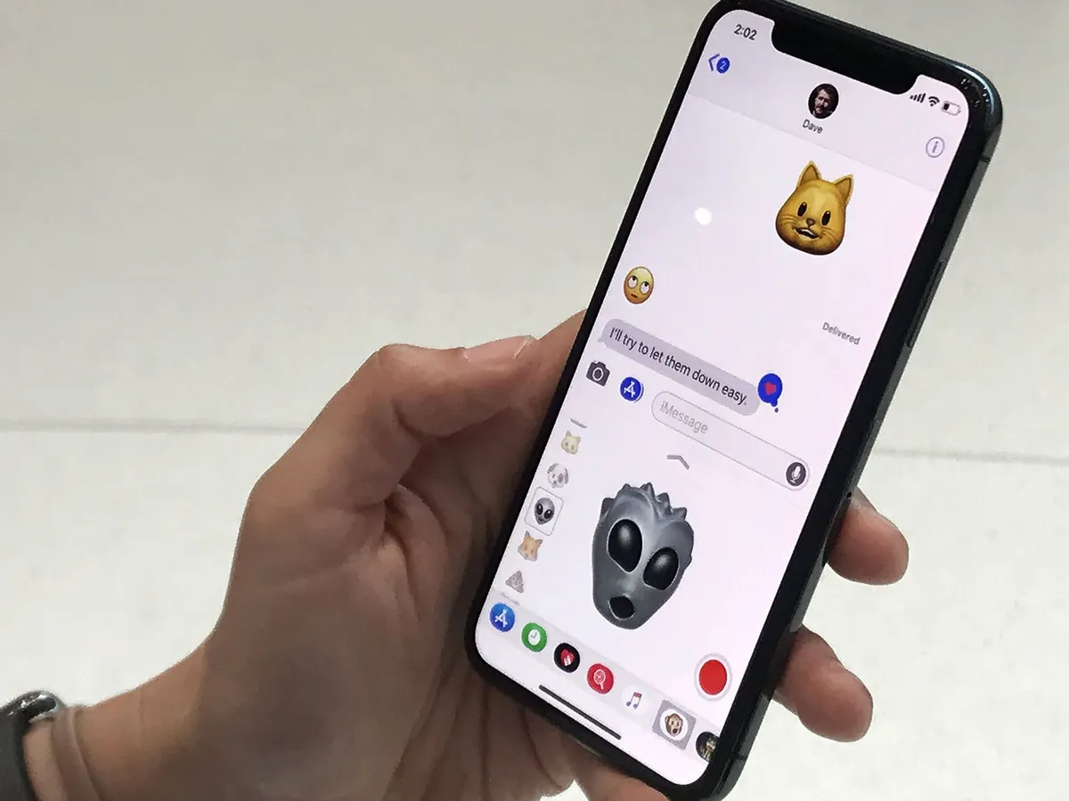
What iOS 11 does have is far greater power without too much additional complexity and far more convenience without hurting approachability. It focuses on a few core things across a wide range of apps and services and ultimately comes together to do exactly what we've come to expect it to do — help us better manage and accelerate our lives.
Each year, every year, some expect Apple to slow down and shore up the foundations. Others expect the company to speed up and push the innovation. This year, we've gotten a good mix of both. At WWDC, Craig Federighi said, in addition to new and updated feature implementation, Apple gave the software engineering teams some time to fix what irked them most. I think it shows. And I think it's a great approach to carry Apple through iOS 11 and into the next decade.
What we get at launch is just the first stage of iOS 11. iPhone 8 will bring the beta for Portrait Lighting iPhone X will introduce a few additional features, like Animoji and Face ID. Future versions, including updates later in the year and into early next year, should improve and round things out further.
For now, what we have is iOS taken to 11. Smarter thanks to machine learning and computer vision. Better thanks to drag-and-drop and Files. Faster thanks to Automatic setup and Instant Notes and Markdown. And Bolder thanks to headlong dive into augmented reality.
And it's available now.
Originally published September 19, 2017. Updated October 31, 2017 for the iOS 11.1 update. Updated December 2, 2017 for the iOS 11.2 update.
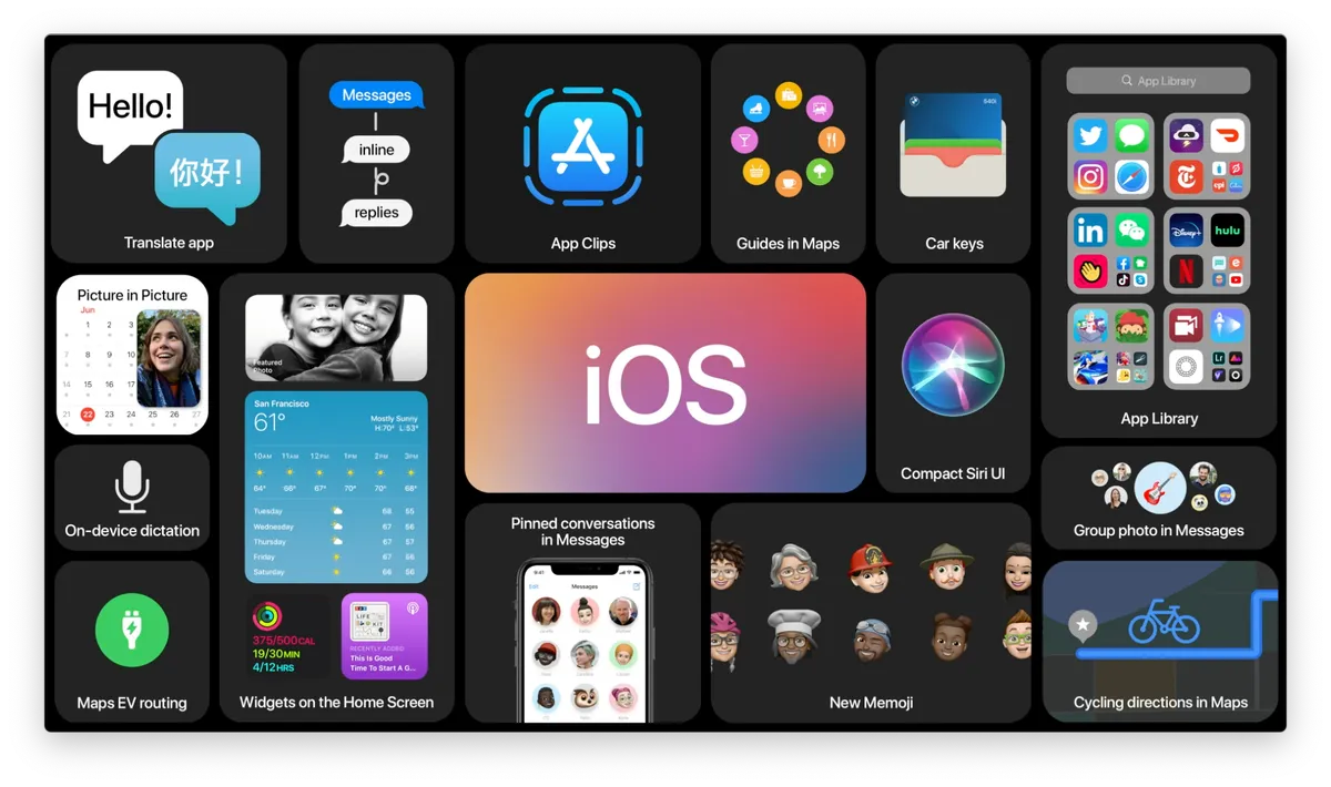


19 years ago, Bill Gates successfully predicted the decline of the iPod but failed to account for Apple’s next revolutionary device

Apple TV Plus reached for the stars with Constellation, but the sci-fi series has been canned after a single season

Rumored iOS 18 Web Eraser AI feature puts Apple on a collision course with a media whose ads it could delete


